Finding home in every map.
When looking at a map, the first instinct for many is to search for home—whether that be a house, a neighbourhood, a city, or even a country. That instinct to orient ourselves, to seek familiarity within a broader landscape, is at the heart of MapHouse.
the name

The name itself reflects this personal scale, symbolizing the journey of finding direction and establishing a place in the world. It also speaks to a broader mission—supporting sole consultants and small business owners as they navigate their own paths, just as we chart our own.
Beyond its meaning, the name carries a personal connection. Growing up, I watched my mother build businesses that proudly bore her name, a tradition I have always admired. MapHouse provided a way to subtly incorporate my initials into the brand, making it both meaningful and uniquely my own.
the symbol
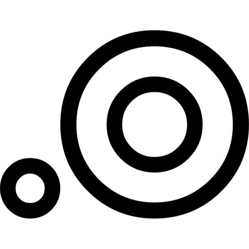
With the name in place, the next step was bringing it to life visually. At first, I considered distilling it down to just initials for a clean, recognizable mark. But while exploring typography, I stumbled upon the Esri Cartography Symbols—and inspiration struck.
The final design is a composition of circles that subtly form the M and the H —seamlessly weaving the essence of MapHouse into a minimalist yet meaningful symbol. But the choice of circles wasn’t just about aesthetics; it was a perfect fit for the brand’s identity.
In cartography, circles are everywhere—pins, points, and markers—the very symbols I use in my work every day. More than just a visual choice, this design is an homage to my experience in Esri software and spatial analytics, where these elements are essential tools for understanding and interpreting data.